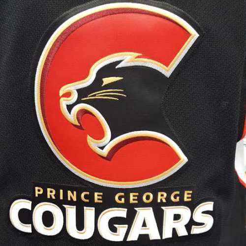
Last Wednesday, Greg Pocock and the rest of the Prince George Cougars ownership and management unveiled the new logo that the team will wear in the upcoming 2015/2016 season. It is the latest step in rebranding the Cougars after the new ownership bought the WHL team from the Brodsky family last year. During the unveiling, the team had the past jersey’s all lined up in order to show the evolution of the club from its days in Victoria. The one constant was the cougars being the same colour as we have all come to expect, however, now the Cougar has taken a different shape and color. The logo look more streamline and slick than ever before. The Cougar looks even more menacing as it pops out of the logo in a more three dimensional manner than previous renditions. The large “C” not only gives reference to the name, but some people have said that it draws inspiration from the Vancouver Canucks and Calgary Flames logo from the NHL. Now, you may ask, is it a positive change from the last logo?
Hell Yeah, it’s a great change for the Prince George Cougars. The fact that it looks significantly different from the other versions of the logos, as well as, having the simplistic look is awesome. The gold trim around the “C” completes the effect of the team’s journey into a new chapter in the franchise. Gone are the days where you would go to a game and know that they are going to lose to every team in the league. This logo signifies that the New Ice Age is one that will revolutionize the way that this team will be seen by the citizens in Prince George as well as every opponent that takes to the ice at the CN Centre. Having a more simple design shows that the team will be looking to keep things simple when facing the opposition, instead of getting caught up in their old ways of mediocrity. But, this new unveiling doesn’t come without a modicum of complaints.
I have talked to a lot of Cougars fans over the past week to gauge what they think of the new logo and jersey. There were three consistent issue that were brought up.
1) Is that a Cougar??? The first issue that most of the fans identified was that the Cougar looks more like a Panther then an actual cougars. While this may be the case due to the colour scheme of the home jersey in particular, the overall aesthetic of the logo still feels like a cougar. The gold trim around the edges tries to convey the proper colour of a cougar without detracting from the overall design.
2) Where are the Patches??? The complaint that I agreed with the most was the absence of shoulder patches on the jersey. Most of the teams in the WHL and all of the teams in the NHL have patches on their shoulders to add more to the overall look of the jersey as well as celebrate some historical or geographical significance during the team’s evolution. The Vancouver Canucks have the old “stick and rink” logo from the 1970’s to commemorate their inception into the NHL alongside the Buffalo Sabres. The Victoria Royals, one of the Cougars rivals, has an alternate logo in the shoulder to pay respect to the city of Victoria. It’s a simple addition that goes a long way in completing the overall look of a jersey. Most of the fans that complained about the lack of a patch suggested they have a simple “P.G” or the original Victoria Cougars logo on the side to connect with the fans that have supported the team through thick and thin. Sometimes more can be a positive thing.
3) Same Jersey??? The last issue that the fans had about the new jersey was that it was the same jersey, but with a different logo. Fans wanted more of an overhaul of the overall jersey than just the logo. Some were tired of the same colour scheme, others were frustrated with the lack of originality of overall design. My thought is, why mess with colours that we can be identified with. The Prince George Cougars have been wearing the same colours for as long as I have lived in this great town. When I see those colours anywhere I go, I think of the Cougars. True, I support the cry for a different design of the jersey to match the awesome logo, but don’t mess with the black, red, and white. Those colours signify hard working citizens of this town that do an honest day’s work for an honest pay. The Cougars are a blue collar team, and those are the colours that work best.
I think the New Ice Age, took an awesome step forward with this new rebranding. I for one will wear the new jersey with pride, because I know that everyone in the organization is trying to make this Prince George’s team once again. Support the New Ice Age, and support your local WHL team. Cougar loud and Cougar proud. I am Smoke Stark, and this has been my rant on the Prince George Cougars new logo. Beware my power, Green Lanterns light!